This article draws on Creative Navy's project work in medtech UX, spanning practice management software, surgical equipment, ventilators, blood pumps, infusion systems, and patient monitoring devices, including Class II and Class III regulated products. Our work in this sector covers clinical environments including the ICU and operating theatre, designing for surgeons, nurses, and biomedical engineers. Dennis Lenard, who leads this work at Creative Navy, is the author of User Interface Design For Medical Devices And Software, the practitioner reference on UX design for medical devices and software. Our approach integrates IEC 62366 usability engineering requirements and FDA Human Factors guidance as structural inputs to the design process, not post-hoc compliance activities.
Over half the people who download a symptom tracking app will delete it within a month. The apps know this. They have not changed the design decisions that cause it.
The deeper problem is what happens to the users who stay. They accumulate months of symptom data in products whose output layers are not built to make that data useful during a clinical consultation. The market has invested heavily in input. It has neglected the moment the input was recorded for.

Symptom tracker UX design
This analysis reviews five apps benchmarked in our March 2023 study against evidence gathered in March 2026, plus two new entrants that have positioned themselves around the gap the established products have left open. The evaluation criteria are: input architecture, analytics quality, physician-facing output, and trajectory since 2023. The intended reader is a product director or senior PM in the chronic illness or digital health space.
Key Statistics
- 53% of mHealth apps are uninstalled within 30 days, primarily due to missing features or poor usability (PMC/MDPI, 2022)
- 32% of users delete health apps within one week due to usability or trust failures (MarketReportsWorld, 2024; indicative, not peer-reviewed)
- Average 30-day user retention for health apps: 18% (MarketReportsWorld, 2024; indicative)
- Clinical trial dropout rate for diabetes management apps: 29.6% (Hu et al., Diabetes Research and Clinical Practice, 2024)
- App-based intervention participants dropped out at a rate 49% higher than waitlist controls across mental health app trials (JMIR/HCPLive, 2025)
- 46% of chronic illness tracker users say the tool changed their approach to managing their health; only 34% share their data with their GP (Bearable, 2024)
- UX cited as a direct adherence factor in approximately 18% of mHealth adherence studies (JMIR, 2022)
The Evaluation Framework
Before reviewing individual products, it helps to name the structural pattern that explains most of what is failing across this category.

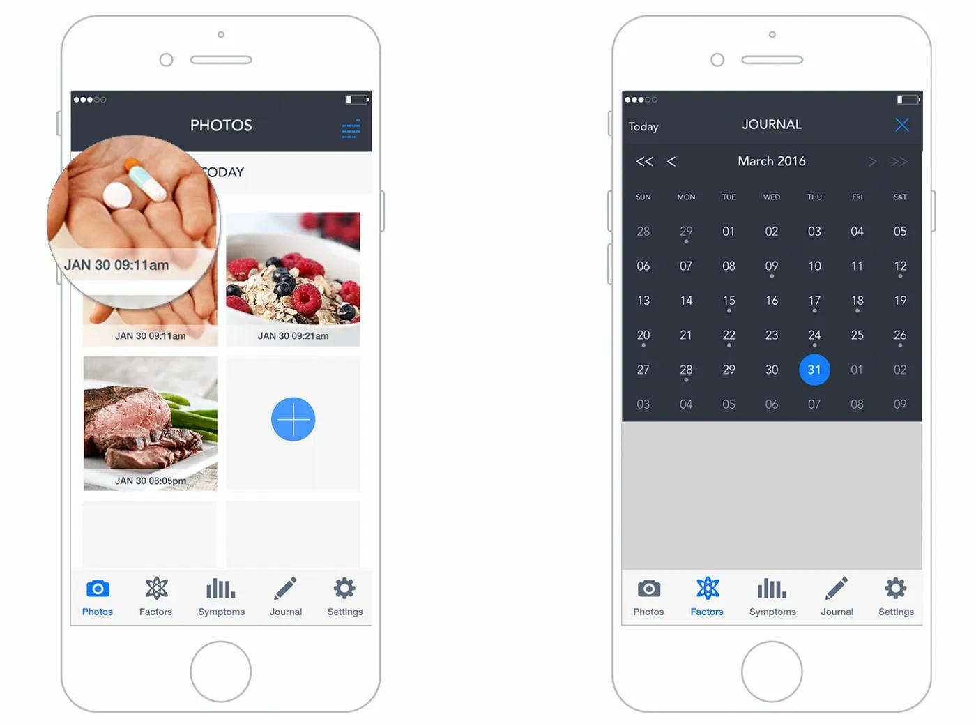
UX of symptom tracker app
The Input-Output Inversion
The apps benchmarked here each began with a coherent purpose: give people with chronic conditions a way to record symptoms over time and surface patterns. The problem is what happened next. Each app added features in response to user requests and competitive pressure, without maintaining a coherent organizing principle for the data those features generate.
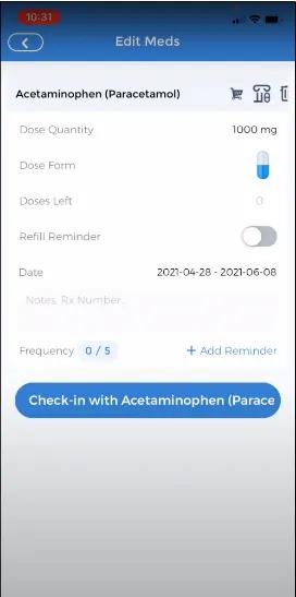
The input side of these apps has received continuous investment: faster logging flows, customizable factor libraries, gamification layers, AI-labelled check-ins, medication reminders with granular dosage options. The output side, the part that answers the question a physician needs answered at a follow-up appointment ("has anything changed since we last spoke?"), has received almost none.
This is the Input-Output Inversion. Products accumulate input sophistication while leaving the output layer at the same level of development it had at launch.
| Criterion | Bearable | CareClinic | Pathways Pain Relief | Health Storylines | Symple |
|---|---|---|---|---|---|
| Input architecture | Strong, increasingly complex | Functional, cluttered | Focused, gamified | Simple | Simple |
| Analytics quality | Good, customizable | Moderate, correlation-focused | Limited | Limited | Minimal |
| Physician-facing output | Absent | Report export only | Absent | PDF export | Doctor Report only |
| Trajectory since 2023 | Growing; core complaints unresolved | AI framing added; architecture unchanged | Unchanged | Undetermined | Undetermined |
Bearable: Scale Without Resolution
Bearable has grown to over 900,000 users as of March 2026. The iOS App Store rating holds at 4.8 stars. By market-standard metrics, this looks like a success.
The UX record tells a more specific story. The two most-requested features on the public product roadmap, active on Changemap as of March 2026, remain unshipped: a web interface and Apple Watch quick-entry. The web interface was formally tabled in 2024.
The absence of a web interface is not a platform preference decision. It is a clinical workflow failure. Users managing chronic conditions frequently need to reference their symptom history during telephone appointments with their GP. During a phone call, a mobile app on the same device is inaccessible. One user on the Changemap roadmap thread described the scenario precisely: "as someone who is chronically ill and disabled, I often have my doctors telephone appointments at home so while I am on the phone I can browse the app on the site! Often so much easier than an app to read things out to the doctor." The app cannot serve this use case. It cannot serve the most clinically important moment the tracking activity is oriented toward.
The clock-entry bug identified in the original 2023 article, where time inputs reset to 12:00 after being set by the user, is still appearing in 2026 user commentary on the same roadmap. A timestamp error in a data-accuracy tool is not cosmetic. It corrupts the longitudinal record the app is built to generate.
What Bearable's trajectory reveals is sense decay at scale. The team publicly acknowledged in 2024 that they are "prioritising making the app less overwhelming," which confirms that the original organizing principle, a flexible multi-variable tracker that grows with health complexity, has been diluted by feature accumulation the underlying information architecture was not built to absorb.
CareClinic: AI Labels, Same Architecture
CareClinic now markets itself with AI-powered insight framing. The product website describes a system that reveals connections between symptoms and factors including medications, foods, weather, stress, sleep, and activity. The Google Play changelog documents a "redesigned biomarker dashboard with smart navigation" and a "check-in learning system."
The user review record from 2024 to 2025 describes a product largely unchanged at the structural level. Reviewers report that premium features are inaccessible despite payment, with one user estimating access approximately 25% of the time. Paywall interruptions persist even for paying users. Free-tier users who log a symptom at the wrong time cannot correct the entry: they must accept corrupted data or delete the record entirely. A symptom tracker that prevents basic data correction produces an unreliable longitudinal record. A physician reviewing that record cannot distinguish symptom patterns from entry errors.
The date-entry failure is the most structurally significant finding. One reviewer described attempting to log symptoms for a previous day and having the app record them to the current date without warning. Retroactive entry is a standard use case: people with high-symptom periods often cannot log in real time. An interface that silently misdates retroactive entries does not just fail that user. It generates longitudinal data that appears plausible but is wrong.
Applying AI labelling to an unchanged information architecture does not resolve the architecture's underlying problems. This is precisely why AI-powered products stall in adoption: the interaction layer cannot carry claims the underlying design has not earned. The AI framing on CareClinic's website describes correlation capabilities that the output layer does not structurally support in the context of a clinical consultation.
Pathways: Coherent but Narrow
Pathways Pain Relief retains its distinctive position. In the 2023 benchmarking, it was the only app assessed as genuinely strong on UI design, and the only one built around a defined therapeutic model: biopsychosocial pain management rather than open-ended tracking.
The app remains iOS-only as of March 2026. The gamified challenges structure and the 14-day challenge reset behaviour noted in the original article both persist, with current App Store commentary still describing progress loss under conditions users cannot predict. Content is useful; the delivery mechanism remains fragile.
The broader observation is that Pathways has not drifted. It has remained coherent. The cost is that it has also remained narrow, and the narrowness is becoming a positioning problem as condition-specific apps proliferate in adjacent categories.
Health Storylines and Symple: No Signal
No traceable changelog entries, user commentary, or product announcements were found for either Health Storylines or Symple in this research pass. Both apps are absent from recent comparative reviews of leading symptom trackers.
Absence of evidence is not evidence of stagnation. It is evidence that both products have become invisible to the discovery mechanisms the target market uses. Whether through product inactivity or distribution failure, neither appears in the active consideration set of users currently choosing a symptom tracker.
New Entrants: What They Signal
Two products entering the market since 2023 reveal where competitive pressure is moving.
Human Health Tracker has built around a 2,000-plus symptom library, body-map location input, AI-powered pattern recognition, and PDF export structured for clinical consultation. It has positioned explicitly around the output gap the established apps have left open.
Staqc markets itself as a post-Bearable alternative for users who have outgrown symptom logging and need deeper analytics and biomarker correlation. It names Bearable by implication as the platform users graduate away from.
Neither product has independent review coverage or verified user volume as of March 2026, so no conclusions about their quality can be drawn. What they signal is clear: the market is identifying the same gap that the practitioner evidence describes. The physician-facing output layer is the unclaimed ground, and new entrants are moving toward it.
The Pattern Across the Landscape
Symptom tracking apps have invested heavily in input architecture and almost nothing in output quality. The result is a longitudinal record patients cannot use in a clinical consultation. Vendor-published data shows that 46% of chronic illness tracker users say the tool changed their approach to managing their health, but only 34% share their data with their GP. The 12-point gap between those figures is where the output layer has failed, and no leading product in this category has addressed it.
Symptom tracker interaction example
The cross-app pattern is this: every product began with a coherent organizing principle and then accumulated features the underlying information architecture was not designed to absorb. The input layer grew. The output layer did not. When accumulated design debt of this kind goes unaddressed across product generations, the gap between what a product promises and what it delivers in practice widens until users work around it rather than through it.
Three failure patterns recur across the landscape:
Data accuracy is not protected. Bearable's unresolved clock-reset bug, CareClinic's silent date-entry error, and CareClinic's locked edit function for free-tier users all produce the same outcome: a longitudinal record that cannot be trusted. A physician reviewing three months of symptom data cannot know which entries are accurate and which are artifacts of interface errors the user could not correct.
The data-to-consultation handoff is not designed. Across all five established apps, the output layer is either a chart view the user manages themselves or a basic PDF export. None has built an output structured around the question a GP asks at a follow-up appointment. Users who want to share their symptom history frequently resort to screenshots, verbal summaries, or handwritten notes.
Feature accumulation without coherence increases abandonment. The Bearable roadmap, the CareClinic review record, and the broader mHealth abandonment literature all point to the same mechanism: complexity that exceeds the user's available cognitive budget, particularly during high-symptom periods, causes abandonment precisely when the data would be most valuable.
Across digital health and clinical workflow projects, what consistently surprises teams is how wide the gap is between data users can record and data clinicians can act on. When users prepare for a medical appointment using a symptom tracker, the pattern is almost always the same: they screenshot charts, describe their data verbally, or write a hand summary, because no existing app produces output in the format a consultation actually requires. The clinician and the user both end up working around a gap the product was supposed to close.
Do High Ratings Prove Clinical Value?
The App Store data appears to contradict the argument above. Bearable holds a 4.8-star iOS rating. CareClinic holds a 4.5-star Google Play rating despite the complaint evidence documented here. If these products are failing clinically, why are users rating them highly?
The ratings reflect the survivor population. Users who delete an app within a week do not leave reviews. The 32% who uninstall within a week and the 53% who leave within 30 days are not in the rating dataset. App Store ratings measure the experience of users who stayed long enough to form an opinion and chose to rate the product. They do not measure whether the product served the full population that needed it.
This matters for product directors making investment decisions. A 4.8-star rating is not evidence that the output layer works. It is evidence that the users who stayed found the input layer good enough to continue. The clinical utility question remains unanswered by that figure.
The stronger evidence is the 12-point gap between the 46% who say tracking changed their health management and the 34% who actually share that data with their GP. That is the measure of what the surviving user population is able to do with a product they rate highly.
The Uncontested Competitive Vector
The competitive vector in the symptom tracking market is not more features or a better input flow. It is output architecture designed around a specific moment: the clinical consultation. A product that translates a patient's longitudinal symptom record into a format a physician can assess in ten minutes would address a problem no current market leader has solved. The physician-patient consultation is the use scenario none of these apps have designed for.
The design principles that close this gap are not novel. They require taking a position on what the product is actually for.
Protect data integrity before adding features. A symptom tracker's value compounds over time only if the longitudinal record is accurate. Timestamp correction, retroactive entry that correctly records to the intended date, and edit-visible audit history must be core functions, not premium features.
Design the output before optimizing the input. Work backward from the consultation. What does a GP need to see after three months of tracking to assess whether a treatment is working? Build the output layer that answers that question, then design the input to feed it.
Design for degraded capacity. The most valuable symptom data is collected during high-symptom periods, when the user's cognitive and physical capacity is lowest. Observational research in live clinical environments consistently reveals the gap between what users manage under normal conditions and what they can sustain when unwell. An input interface that requires sustained attention to complete during a symptom flare is one that fails precisely the users who need it most. Quick-capture for difficult periods, with richer input available when capacity is higher, is a constraint-respecting approach no current product has structurally implemented.
Treat the clinical handoff as the primary use scenario. Every design decision should be evaluated against the chain from daily experience to medical decision. A mobile-only architecture that cannot be referenced during a telephone consultation with a GP is a chain with a broken link. Field research conducted across live clinical environments has shown repeatedly that the gap between what users need during a clinical interaction and what the interface can deliver in that moment is rarely visible until you observe the actual consultation. Designing for that moment requires observing it.
Limits and Gaps
The evidence available for Health Storylines and Symple is insufficient to assess their current state. Both may have changed materially since 2023; no traceable evidence exists to determine this either way.
The retention and abandonment statistics cited here are drawn from broad mHealth market research, not from studies specific to symptom tracking apps. The MarketReportsWorld figures are from a market research report rather than peer-reviewed literature and should be treated as indicative. The diabetes management trial dropout rate is a domain proxy, not a direct measure of this product category.
User review evidence from app stores and roadmap threads is self-selected. It over-represents users with strong opinions and under-represents the majority who left without comment. The practitioner findings from the Zachary Watson design portfolio were drawn from six patients and two physicians: a useful directional signal, not a generalisable sample.
Human Health Tracker and Staqc have no independent review coverage as of March 2026. They are directionally significant as market signals. No conclusions about their design quality or clinical utility are possible from available evidence.
What This Landscape Tells You
The symptom tracker market is not failing because the engineering is poor or the features are sparse. It is failing because the products have drifted from the organizing principle that makes them useful: generating longitudinal data a physician can interpret at a consultation.
The leading apps have grown their user bases, earned high ratings, and continued adding features. Meanwhile, the clock-reset bug persists in Bearable. CareClinic's data-correction function stays behind a paywall. No product in the category has built a physician-facing output a GP can use without the patient translating it first.
That is the Input-Output Inversion operating at market scale. It is also a competitive vector that no current market leader has claimed. The users who delete these apps within a week are not lost to the category: they are evidence that the category has not yet built a product that earns retention. The question is whether your organization will build it.
Frequently Asked Questions
What is the biggest UX failure in symptom tracking apps in 2026? The most consequential failure is the output layer. Every leading app has invested in how patients log symptoms. None has built a reporting structure that gives physicians what they need at a follow-up consultation: a readable summary of what has changed, what patterns emerged, and whether an intervention has had a measurable effect. Patients carry months of tracking data to appointments and summarise it verbally because no app has designed for the consultation itself.
Why do symptom tracker apps have high App Store ratings despite persistent usability problems? Ratings reflect the survivor population: users who stayed long enough to form an opinion. Between 32% and 53% of health app users uninstall within a week to a month, and those users do not leave reviews. A 4.8-star rating measures the experience of users who stayed, not users who left. Clinical utility and App Store rating are measuring different things.
Does adding AI to a symptom tracker improve its clinical utility? Not if the information architecture underneath it is unchanged. CareClinic's AI marketing describes correlation capabilities that the underlying output layer does not structurally support in a clinical consultation context. AI labelling applied to an architecture that misdates retroactive entries and locks data correction behind a paywall does not produce clinically useful output. It adds marketing language to an unresolved structural problem.
What is the Input-Output Inversion in symptom tracking apps? The Input-Output Inversion describes how apps in this category have concentrated design investment on the data entry experience while leaving the output layer at approximately the same level of development it had at launch. Users can log symptoms with reasonable efficiency but cannot translate that data into a format a physician can use without significant additional effort. The inversion is the gap between where investment went and where clinical value is generated.
Why is Bearable's mobile-only architecture a clinical workflow problem? Many patients with chronic illness have telephone appointments with their GP. During a call, referencing a mobile app on the same device is not possible. A web interface would allow users to view and discuss their symptom history during a phone consultation. Bearable formally tabled its web interface development in 2024, leaving a gap in the primary clinical use scenario: the moment when longitudinal tracking data is most needed and least accessible.
Which symptom tracker apps perform best on data accuracy as of 2026? None of the apps benchmarked here treats data accuracy as a systemic design property. Bearable has an unresolved clock-reset bug present since at least 2023. CareClinic prevents free-tier users from correcting time-stamped entries and records retroactive entries to the wrong date without user notification. Pathways Pain Relief loses challenge-progress data unpredictably. Data accuracy is the precondition for clinical utility, and no current leading product has designed for it structurally.
References
Bearable. (2024). Choosing the best symptom tracker in 2024. Bearable blog. https://bearable.app
Bearable. (2026, March). Product roadmap. Changemap. https://changemap.co/bearable
ChoosingTherapy. (2024, June). Bearable app review. https://www.choosingtherapy.com
CareClinic. (2026, March). Symptom tracker. CareClinic website. https://careclinic.io
Creative Navy. (2023, March). Symptom tracker UX design patterns and benchmarking. Medium. https://medium.com/@creativenavy
Hu, Y., et al. (2024). Dropout rate in clinical trials of smartphone apps for diabetes management: A meta-analysis. Diabetes Research and Clinical Practice. https://www.sciencedirect.com/journal/diabetes-research-and-clinical-practice
Jiang, M., et al. (2022). User engagement and abandonment of mHealth: A cross-sectional survey. MDPI/International Journal of Environmental Research and Public Health. https://www.mdpi.com
JMIR. (2022). Factors influencing adherence to mHealth apps for prevention or management of noncommunicable diseases. Journal of Medical Internet Research. https://www.jmir.org
Linardon, J., et al. (2025). Dropout from app-based psychological interventions: Meta-analysis. Reported in HCPLive, February 2025. https://www.hcplive.com
Nascimento, B., et al. (2022). A large scale analysis of mHealth app user reviews. Empirical Software Engineering. https://link.springer.com/journal/10664
Watson, Z. (2026, March). Symplog: Application for sharing and tracking chronic illness symptoms. Design portfolio case study. Accessed March 2026.
In this story
Leading symptom tracker apps have invested heavily in input flows while leaving the physician-facing output layer underdeveloped. This benchmarking review identifies the structural failures driving abandonment, the Input-Output Inversion pattern visible across the category, and the competitive vector no current market leader has claimed.
- Key Statistics
- The Evaluation Framework
- CareClinic: AI Labels, Same Architecture
- Pathways: Coherent but Narrow
- Health Storylines and Symple: No Signal
- New Entrants: What They Signal
- The Pattern Across the Landscape
- Do High Ratings Prove Clinical Value?
- The Uncontested Competitive Vector
- Limits and Gaps
- What This Landscape Tells You
- References